Julia Burns
Design Document
Mission:
Create a website for Diva's Nightclub to present it as upscale, hip, and attractive to area young people ages 18-25.
Requirements:
Design an interface which is clearer than the current one: make navigation simple and intuitive.
I believe I accomplished this with the navigation bar. I began with the
navigation bar from
w3schools.com but modified it to fit my needs by making the tab of the page the user is currently on appear to be permamently selected. This is an extension of the rollover effect which makes the page more intuitive to navigate.
Maintain the lavender-on-black color scheme while adding visual interest
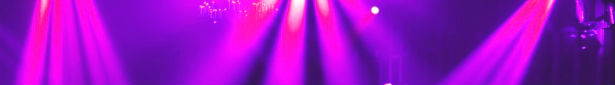
I did stick to the color scheme for the new site, but added the rainbow "Northampton" in the logo to emphasize that this is an LGBT nightclub, as well as "pops" of color in the images.
Create a cohesive aesthetic while giving different moods to the different themed nights and events
I kept the pages cohesive with the same layout, navigation bar, and header image, but I used different main images on each page to keep them interesting and unique.
Incorporate images throughout the site, instead of in a separate "Image Gallery".
I used several different images throughout the site, and chose quality over quantity by using only a few visually arresting images instead of more low-quality ones. I kept them cohesive by focusing on the spotlight motif.
Keep pages small, with no scrolling needed.
The website should only need scrolling on the smallest of screens. I used JavaScript to hide some content and only display it with a click on the "themed nights" and "upcoming events" pages: to create this effect, I started with the first JavaScript functions lab we did in class and worked from there.
I believe I accomplished my goals for this website. My philosophy while creating it is that good design is clear design. I included all the required elements and tried to make them flow into the design without being distracting. The main purpose of this website is to get the user the information they're looking for in the most direct way possible. For this reason, an elegant, direct design that works well is superior to a confusing one with many features and gimmicks.
I tested the web site on Firefox, Chrome, and Safari. It works on Internet Explorer but I was unable to get the formatting to work as nicely.